Text
This component displays text with customizable styling and interaction options. It supports colors, background states, padding, borders, accessibility labels, text alignment, and interaction callbacks. It can be used for labels, inline text, or as an interactive element (e. g. links).
Constructors
Link
Link performs a best guess based on the given href. If the href starts with http or https the window will perform an Open call. Otherwise, a local forward navigation is applied.
Link(nil, "Nago Docs", "https://www.nago-docs.com", "_blank")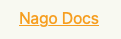
LinkWithAction
LinkWithAction creates an interactive link-like text component. It applies underline styling, interactive color, and attaches an action callback.
	LinkWithAction("Nago Docs", func() {
		fmt.Printf("Nago is easy to use")
	})
MailTo
MailTo creates a mailto: link text component. When clicked, it opens the user’s email client with the given email address.
MailTo(nil, "Worldiety", "info@worldiety.de")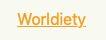
Text
package main
import (
"fmt"
"go.wdy.de/nago/presentation/ui"
)
func main() {
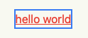
ui.Text("hello world").
Action(func() {
fmt.Print("Nago is easy to use")
}).
Underline(true).
Color("#eb4034").
Border(ui.Border{}.Width("2px").Color("#4287f5"))
}
Methods
| Method | Description |
|---|---|
AccessibilityLabel(label string) | AccessibilityLabel sets the label of the text. The content of the label is also displayed in the tooltip that appears when you hover over the Text. |
Action(f func()) | Action executes the function when the component is clicked. |
BackgroundColor(backgroundColor Color) | BackgroundColor sets the color of the background. |
Border(border Border) | Border draws a Border around the component. It’s used to set the Border width, color and radius. Fore more information also have a look at the Border component. |
Color(color Color) | Color sets the Color of the font. |
FocusedBorder(border Border) | FocusedBorder sets the Border width, color and radius when the component is focused. |
Font(font Font) | Font sets the size, style and width of the Text. For more information also have a look at Font. |
Frame(frame Frame) | Frame sets the width, minWidth, maxWidth, height, minHeight and maxHeight. |
FullWidth() | FullWidth sets the width to 100%. |
HoveredBorder(border Border) | HoveredBorder sets the Border width, color and radius when component is hovered. |
Hyphens(h Hyphens) | |
LabelFor(id string) | |
LineBreak(lb bool) | LineBreak de-/activates line breaking in between the Text. |
Padding(padding Padding) | Padding sets a top, right, bottom and left spacing. |
PressedBorder(border Border) | PressedBorder sets the Border width, color and radius when the component is clicked. |
Resolve(b bool) | Resolve tries to resolve the current text content against the window bundle at render time to translate its contents. This may cause a lot of redundant or wrong lookups and therefore it is disabled by default. |
TextAlignment(align TextAlignment) | TextAlignment sets the position of the Text. For more information also have a look at TextAlignment. |
Underline(b bool) | Underline underlines the Text. |
Visible(visible bool) | Visible decides whether a text is shown. |
WithFrame(fn func(Frame) Frame) | WithFrame sets width, minWidth, maxWidth, height, minHeight and maxHeight using a function. |
WordBreak(wordBreak WordBreak) |