Accordion
An accordion shows a header which the user clicks to expand or collapse the body below it, e.g. for FAQs or
optional details. It lives in package presentation/ui/accordion. Whether it is open is kept in a
*core.State[bool], so you can also open or close it from code.
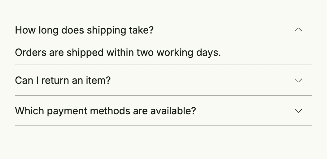
shipping := core.AutoState[bool](wnd).Init(func() bool { return true })
returns := core.AutoState[bool](wnd)
payment := core.AutoState[bool](wnd)

return VStack(
	accordion.Accordion(
		Text("How long does shipping take?"),
		Text("Orders are shipped within two working days."),
		shipping,
	).FullWidth(),
	accordion.Accordion(
		Text("Can I return an item?"),
		Text("You can return every item within 30 days."),
		returns,
	).FullWidth(),
	accordion.Accordion(
		Text("Which payment methods are available?"),
		Text("Invoice, credit card and direct debit."),
		payment,
	).FullWidth(),
).Frame(Frame{Width: L480})
Each accordion is independent; if only one may be open at a time, close the others in an Observe of each state.
Constructors
| Constructor | Description |
|---|---|
func Accordion(header, body core.View, open *core.State[bool]) TAccordion | Creates an accordion with the given header and body, bound to the open state. |
Methods
| Method | Description |
|---|---|
Frame(frame ui.Frame) TAccordion | Frame sets the accordions frame to control the accordions bounds. |
FullWidth() TAccordion | FullWidth sets the accordion’s frame to full width. |
HideSeparator() TAccordion | HideSeparator sets a flag to hide the bottom border (separator) of the accordion. |
InputValue(input *core.State[bool]) TAccordion | InputValue binds the accordion to an external boolean state, allowing it to be controlled from outside the component. |
Small() TAccordion | Small sets the small flag to enable a smaller visual appearance of the accordion. |
Related
- Hover Group, Conditional rendering
- Tutorials: Accordion