Data View
The data view presents a collection as table, cards or list, depending on the window size, and adds
search, sorting, selection and a create button. FromSlice works on a plain slice, FromData loads the
entries of a repository or use case by ID. It is the standard view for overview pages of entities.
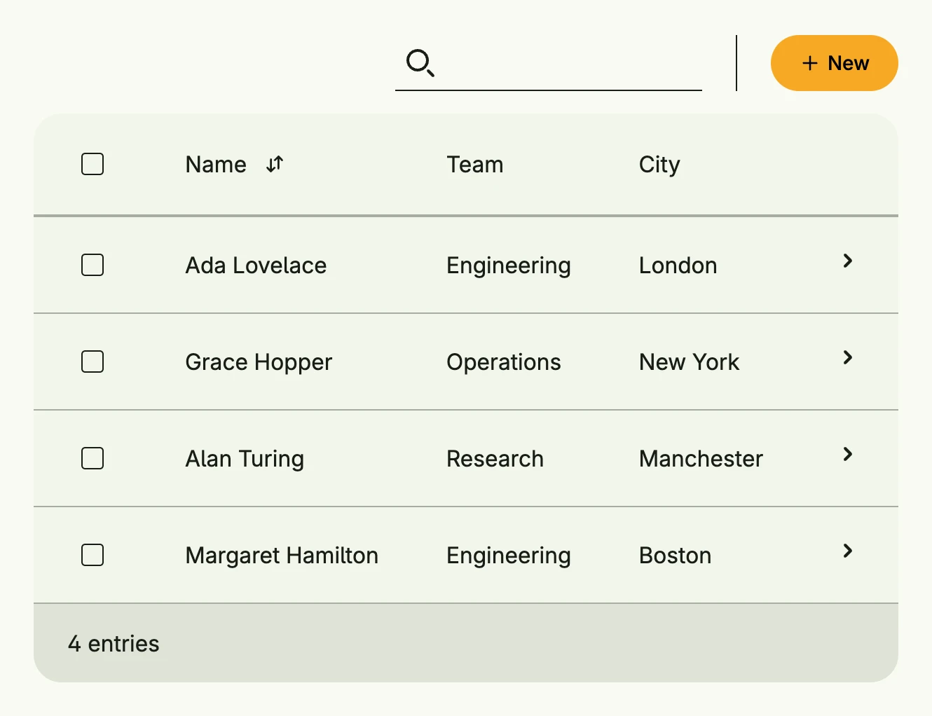
func view(wnd core.Window) core.View {
    type employee struct {
        Name, Team, City string
    }

    employees := []employee{
        {"Ada Lovelace", "Engineering", "London"},
        {"Grace Hopper", "Operations", "New York"},
        {"Alan Turing", "Research", "Manchester"},
        {"Margaret Hamilton", "Engineering", "Boston"},
    }

    type E = dataview.Element[employee]

    return dataview.FromSlice(wnd, employees, []dataview.Field[E]{
        {
            ID:   "name",
            Name: "Name",
            Map:  func(e E) core.View { return Text(e.Value.Name) },
            Comparator: func(a, b E) int {
                return strings.Compare(a.Value.Name, b.Value.Name)
            },
        },
        {
            ID:   "team",
            Name: "Team",
            Map:  func(e E) core.View { return Text(e.Value.Team) },
        },
        {
            ID:   "city",
            Name: "City",
            Map:  func(e E) core.View { return Text(e.Value.City) },
        },
    }).
        Search(true).
        Selection(true).
        CreateAction(func() {
            // open a create dialog
        }).
        Action(func(e E) {
            // open the details of e.Value
        })
}
Constructors
func FromData[E data.Aggregate[ID], ID ~string](wnd core.Window, data Data[E, ID]) TDataView[E, ID]FromData creates a data view which loads its entries by ID, see Data.
func FromModel[E data.Aggregate[ID], ID ~string](wnd core.Window, model pager.Model[E, ID], fields []Field[E]) TDataView[E, ID]FromModel creates a data view from an existing pager model.
func FromSlice[T any](wnd core.Window, slice []T, fields []Field[Element[T]]) TDataView[Element[T], Idx]FromSlice takes the given slice of T and wraps it into an index Element box, so that the identity is based on the index within the slice.
Methods
| Method | Description |
|---|---|
Action(fn func(e E)) TDataView[E, ID] | Action sets a global listener which is triggered, if an entry has been clicked. |
ActionBarContent(content core.View) TDataView[E, ID] | ActionBarContent allows the user to set some custom content to be shown in the action bar e.g., a short description. |
CardOptions(cardOptions CardOptions) TDataView[E, ID] | CardOptions configures the card style. |
CreateAction(fn func()) TDataView[E, ID] | CreateAction is a conventional default factory to create a new element for this data view. |
CreateActionView(view core.View) TDataView[E, ID] | CreateActionView inserts the given view to idiomatic position for creating new elements. |
CreateOptions(actions ...CreateOption) TDataView[E, ID] | CreateOptions is default factory for [TDataView.NewActionView]. |
ListOptions(listOptions ListOptions[ID]) TDataView[E, ID] | ListOptions configures the list style. |
ModelOptions(opts pager.ModelOptions) TDataView[E, ID] | ModelOptions sets the internal model options used to render directly. |
NextActionIndicator(b bool) TDataView[E, ID] | NextActionIndicator sets a flag if another column should be appended to indicate that an entry has an attached next-action. |
Search(visible bool) TDataView[E, ID] | Search shows or hides the search field. |
SelectOptions(options ...SelectOption[ID]) TDataView[E, ID] | SelectOptions adds a default options button, which is enabled if at least a single item is selected. |
Selection(showSelection bool) TDataView[E, ID] | Selection enabled the flag to show or hide data selection. |
SelectionChanged(fn func([]ID)) TDataView[E, ID] | SelectionChanged sets a callback which is triggered when the selection of this data view has changed. |
Style(style Style) TDataView[E, ID] | Style selects Auto, Table, Card or List; Auto picks by window size. |
TableOptions(tableOptions TableOptions) TDataView[E, ID] | TableOptions configures the table style. |